
Formatting a Screenplay According to Industry Standards

Formatting a Screenplay According to Industry Standards
Writing a film script requires a careful balance between artistic vision and strict technical guidelines. When you submit a manuscript to a major competition or industry contest, judges rarely care about fancy decorative elements. They check whether your work adheres to established industry norms. According to the foundational guidelines published by the Academy Nicholl Fellowships, professional scripts follow recognizable conventions that allow readers to visualize a movie clearly on the page. As noted in the official guidance provided by the Academy Nicholl Screenwriting Resources, professional American screenplays exhibit minor variations while maintaining a strict baseline layout.
Writing a script requires specific layout rules to estimate screen time accurately. Margin sizes, line spacing, and capitalization rules help calculate that one page of a properly formatted script translates to roughly one minute of screen time. Incorrect margins or font sizes break this timing metric. Adhering to professional specifications protects pacing and shows readers that a writer understands production office operations.
The Core Typography and Layout Rules
Choosing the right font is your first line of defense against an instant rejection. For decades, the industry standard has remained fixed on a single typeface. You must write your manuscript in 12-point, non-proportional Courier. Proportional fonts like Arial or Times New Roman throw off word counts and alter page lengths, which immediately signals an amateur writer. The Academy Nicholl resources emphasize that 12-point Courier is the expected baseline for all submitted work.
Page margins demand equal precision. Your left margin should be set to 1.5 inches to allow room for hole punching and brass brading when printed physically. The right margin should sit around 1 inch. Top and bottom margins must also measure 1 inch. Within these boundaries, character names, parentheticals, and dialogue blocks indent by specific increments. Character names typically indent 3.7 inches from the left edge, while dialogue blocks start at 2.5 inches and end at 6 inches. Description paragraphs span the entire width from the 1.5-inch left margin to the 1-inch right margin.
Spacing creates visual breathing room on the page. You must leave a blank line between scene headings and action lines, between action lines and character cues, and between blocks of dialogue. Never double space your entire script. Single spacing applies to action blocks and dialogue, while double spacing occurs exclusively between distinct structural elements.
Structure of a Scene Heading and Action Lines
Every new location begins with a scene heading, often called a slugline. This line tells the reader whether the scene takes place inside or outside, where the action is happening, and whether it is day or night. A standard scene heading always starts with either EXT. for exterior or INT. for interior, followed by the specific location name and a time indicator like DAY or NIGHT. For example, you might write INT. COFFEE SHOP - DAY.
Capitalization plays a strict role here. Scene headings must be written entirely in capital letters. When you introduce a major character for the first time in the action description, their name must also appear in ALL CAPS, accompanied by a brief age or descriptor. Subsequent references to that character return to standard sentence case.
Action lines must remain concise, filmable, and punchy. You should write action in the present tense, focusing strictly on what an audience can see and hear on screen. Avoid writing unfilmable internal thoughts, novelistic flourishes, or complex directorial instructions. A reader wants to move quickly through the physical beats of the story. According to the judging criteria outlined by the Academy Nicholl Judging Criteria, evaluators look closely at how description and dialogue build conflict, drama, and tension rather than getting bogged down in overly dense paragraphs.
Dialogue Block Mechanics and Formatting
Formatting dialogue requires precise alignment to ensure actors and directors can read lines smoothly during a read-through. The character name introducing the speech sits centered above the dialogue block in capital letters. If a character speaks from off-screen or through a telephone, you append a parenthetical modifier like (O.S.) or (V.O.) directly after their name.
Parentheticals, sometimes called wrylies, sit inside the dialogue block on their own line. Professional writers use parentheticals sparingly, reserving them for necessary vocal cues or physical actions that interrupt speech. If a character takes a sip of water or changes tone drastically mid-sentence, a parenthetical guides the actor. Overusing parentheticals signals insecurity, because strong dialogue conveys emotion and subtext without micro-management on the page.
Extraneous camera directions, such as CLOSE UP ON, ZOOM IN, or CUT TO, must be avoided in a spec script unless the story requires them. Writing a spec script is an exercise in storytelling, not directing. Pepper pages with camera angles, and you intrude upon the work of the eventual director and cinematographer. Experienced screenwriters trust action lines and character interactions to imply the necessary visual focus.
Title Pages and Modern Digital Submission Standards
The title page of a screenplay follows a stark, minimalist structure. In the center of the page, type the title in capital letters, followed by the word "by" and your name or pseudonym. In the bottom left or right corner, include your contact information, such as email address and phone number. Keep decorative artwork, logos, and copyright notices off the title page, as these mark your manuscript as unprofessional.
When submitting work to major institutions, technical compliance is required. Under the rules specified by the Academy Screenplay Technical Requirements, submissions must be provided as read-only PDF files. These platforms enforce strict size limitations—such as a maximum file size of 5 MB—and prohibit embedded hyperlinks or images inside the document body.
Preparing your PDF correctly ensures that the formatting you worked hard to establish does not shift when opened on a reader's tablet or computer. Always convert your final script directly from your screenwriting software into a digital PDF rather than scanning a physical printout. This guarantees crisp text and searchable pages for contest readers and studio assistants.
Key Takeaways

Stick to 12-point, non-proportional Courier font for every professional screenplay submission.
Maintain standard margins with a 1.5-inch left indent to accommodate traditional brads and hole punches.
Write action lines in the present tense, focusing exclusively on filmable sights and sounds.
Limit camera angles and directional cues to let the narrative speak for itself.
Export your final manuscript as a text-only, read-only PDF within digital file size limits.
What is the difference between a spec script and a shooting script?
A spec script is written independently to present storytelling ability to the industry. It uses primary scene headings and omits technical camera directions or scene numbers. A shooting script is produced during pre-production for the actual cast and crew, featuring numbered scenes and explicit technical breakdowns for every camera setup.
Why must I use Courier 12-point font?
Courier 12-point font is a non-proportional typeface where every letter occupies the exact same horizontal space. This consistency allows industry professionals to estimate that one typed page equals precisely one minute of screen time on film.
Can I include images or graphics on my title page?
No. Professional screenplay standards require a clean, text-only title page. Adding graphics, decorative borders, or studio logos immediately identifies the manuscript as amateur work.
How should I indicate a character's name in the action lines?
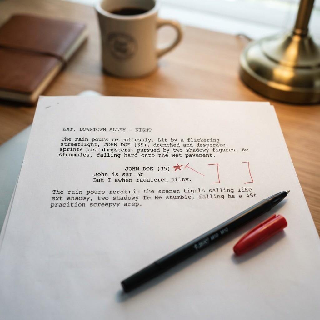
When a character appears for the very first time in your action description, you must write their name entirely in capital letters, often followed by their age in parentheses. Every time that character appears later in the script, you use normal sentence case.
What are parentheticals and when should I use them?
Parentheticals are brief behavioral or vocal instructions placed inside parentheses within a dialogue block. Writers use them sparingly, only when an action or emotional shift is needed to understand the spoken line.
Are camera directions allowed in a spec script?
You should avoid camera directions like CUT TO or CLOSE UP in a spec script. Screenwriting relies on clear action and dialogue to imply visual storytelling, leaving technical framing choices to the director and cinematographer.
How do I format a telephone conversation between two characters?
When two characters speak over the phone, you can indicate this by adding the parenthetical modifier (V.O.) or (O.S.) next to their character names, or by structuring the scene as a dual dialogue block or alternating between their physical locations using mini-sluglines.
By mastering these core conventions, you transform your manuscript from a confusing puzzle into an invitation for collaboration. Industry readers appreciate clean pages because they signal an experienced writer who respects their time. Whether you are aiming for a fellowship, entering a major contest, or pitching directly to production companies, meticulous attention to formatting lets your narrative voice stand out for all the right reasons.
Final Polish and Self-Editing Checklist
Before you export your final manuscript and upload it to a portal or send it to an executive, run through a rigorous self-editing checklist. Even the most compelling premise can stall if basic typos or layout flaws distract the reader.
First, check your page count. A feature-length spec script should ideally land between 90 and 120 pages. If your script runs 140 pages, you likely have overwritten description blocks, bloated dialogue, or subplots that need trimming. Conversely, a 75-page script usually indicates thin character development or missing structural turning points.
Next, search your document for orphan character names. An orphan occurs when a character name appears at the very bottom of a page with their dialogue pushed entirely to the next page. Professional screenwriting software usually handles pagination automatically to prevent this, but manual formatting tweaks can sometimes break these rules. Ensure that every character cue is accompanied by at least one line of dialogue on the same page.
Finally, verify that your transition terms—like CUT TO: or FADE OUT—are used sparingly. Many modern writers omit transitions altogether, moving cleanly from one scene heading to the next. If you do use them, align them properly against the right margin. By following these industry standards and polishing your manuscript, you present your work with the professionalism required to capture the attention of readers and decision-makers.